DfE Concerns Casework - Designing clarity for complex casework
Project overview
This internal platform supports caseworkers who manage concerns about academies and multi-academy trusts. It replaces a fragmented set of legacy systems, spreadsheets, and local workarounds. I worked on this project across two phases: Alpha (Sept 2020 – Jan 2021) and Beta (Summer 2021 – June 2022), returning between other project placements at DfE. I led the interaction design and prototyping work, collaborating closely with researchers, BA, PM, and developers.
The problem
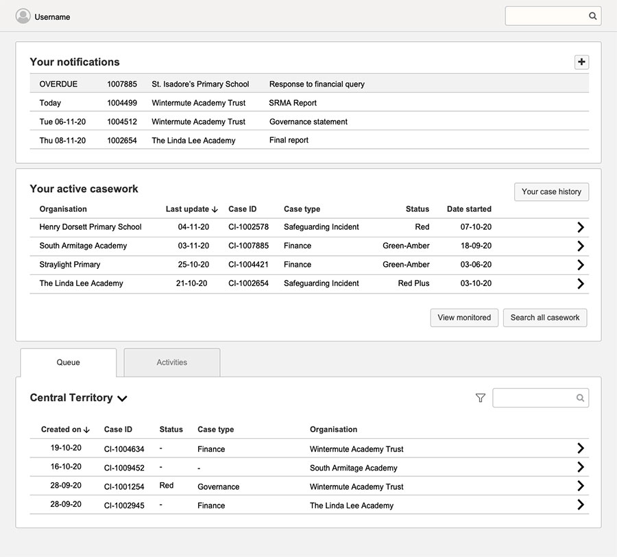
The legacy systems used by caseworkers were inconsistent and difficult to use. Many teams had resorted to building their own spreadsheets, documents, and processes — making the national picture fragmented and labour-intensive to manage. Meetings dragged on, timelines were unclear, and work was often duplicated. Some staff had low trust in new systems due to previous tech disappointments, and were cautious about adopting something new. The aim was to create a single, coherent tool that supported complex, nuanced casework — without oversimplifying it.
What I did
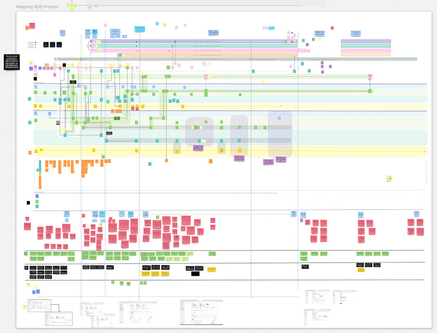
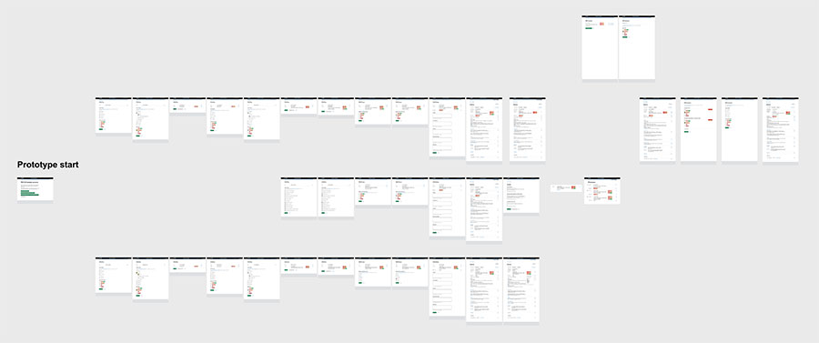
In Alpha, I led rapid weekly prototype iterations using Axure — with permission to do so rather than the GDS kit, as I had deep experience with the tool and could move faster. I was new to the Prototyping Kit at the time.
Each week followed a tight rhythm: I worked with the user researcher to test the prototype with real caseworkers, gather feedback, analyse findings, and iterate based on what we learned. One participant described the homepage as “doesn’t mean much to me at the moment” — a clear sign we needed to improve orientation and language. That type of direct feedback helped us simplify labels, clarify task groupings, and refine what was shown at each step. In one round, we heard: “Just knowing the name is not helpful — is it safeguarding, general?” which pushed us to revise how enquiry types were displayed and sorted, adding clearer context to reduce cognitive load.
This ran for 8 consecutive weeks, with each iteration presented and discussed with the wider team.
“That seems good… this is better.”
The pace was intense but focused, and the Alpha concluded with a successful assessment. The panel approved the project for Beta and noted the strength of the user-centred design work. While the project then paused for a technical discovery phase, I moved to another DfE project before returning to lead design in the Beta phase once build work began.
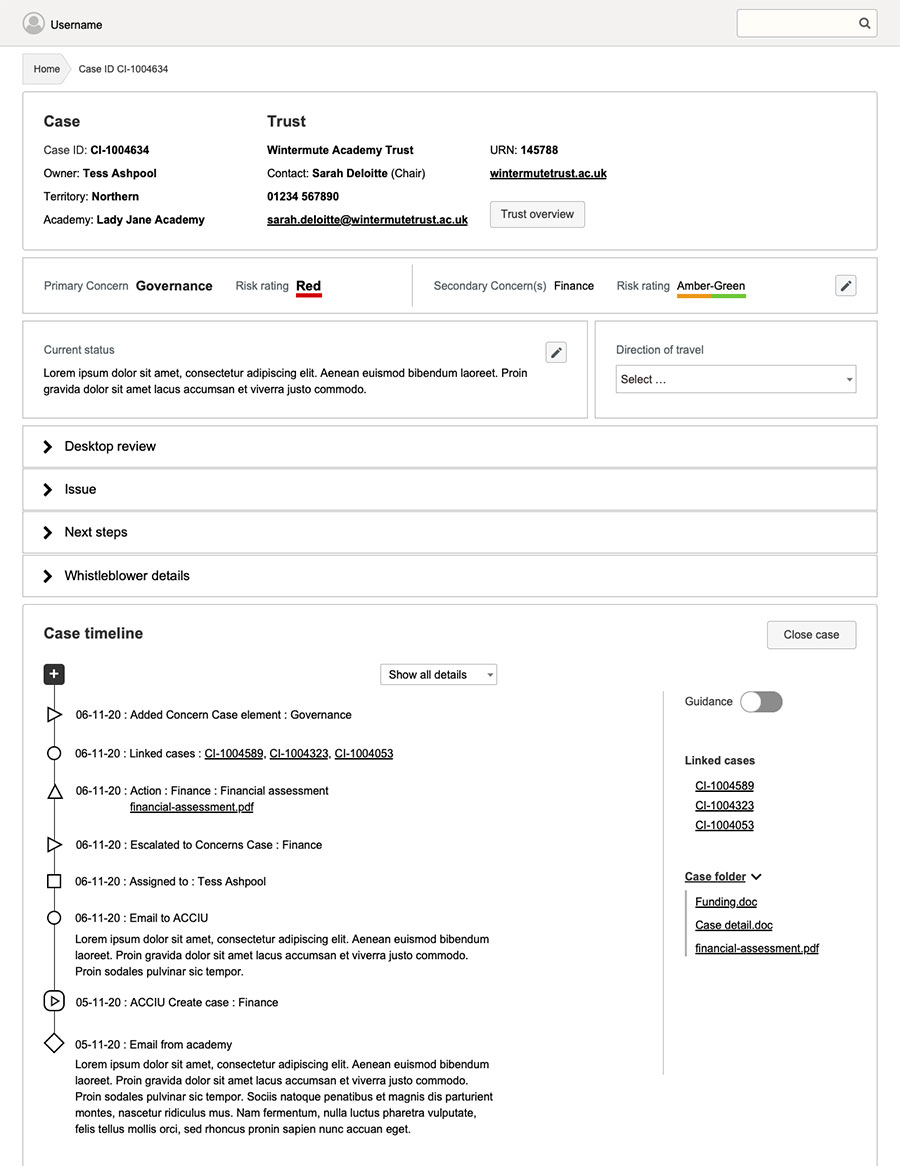
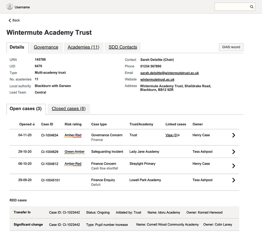
In Beta, we explored deeper behavioural and process-level detail. Caseworkers had highly specific ways of working, often tailored around legacy constraints. We needed to earn their trust while designing something flexible enough to accommodate variation. I focused on designing interaction flows that reflected how people actually worked, while carefully introducing structure and consistency.
I also supported research sessions with users in schools and trusts, helping to understand how the new platform might impact them and what concerns they might have. Where a process required offline meetings or decision making, I designed the system to support a light-touch, realistic approach — avoiding false automation.
Throughout, I worked closely with the PM, BA, and developers to ensure our prototypes reflected technical constraints while staying grounded in user needs.
The outcome
The first live version of the platform launched in 2023. When I later spoke to the BA on the project, I was told it had been well received and had no reported negative feedback in its first six months of use — rare for a government back-office system. Teams found it clearer, faster, and easier to work with, and early signs showed a reduction in the number of meetings required to manage cases.
We had talked about the new system laying the foundation for more proactive casework — freeing staff up to support schools earlier, rather than only reacting once a problem had escalated. Helping to develop a more a positive and supportive relationship with users.
What I learned
This was one of the most collaborative, high-pressure projects I’ve worked on. The pace of weekly testing and iteration during Alpha sharpened my ability to make quick, clear design decisions based on real feedback. In Beta, I saw how important it is to respect — and work with — people’s existing processes when designing change. We weren’t just redesigning a tool, but building confidence and trust in a better way of working. It was a reminder that sometimes the real design work happens between the pixels — in how you listen, how you shape conversations, and how you respect the emotional complexity of the service you're supporting.