DfE Connect - Making school guidance easier to find
Project overview
DfE Connect (formerly ‘School Account’) is a secure platform that helps school business professionals and trust leaders access services and information in one place. I led the interaction and UI design for both the public-facing platform and an internal tool known as the Task and Service Index (TSI). I was part of the project team from August 2023 to June 2024.
The problem
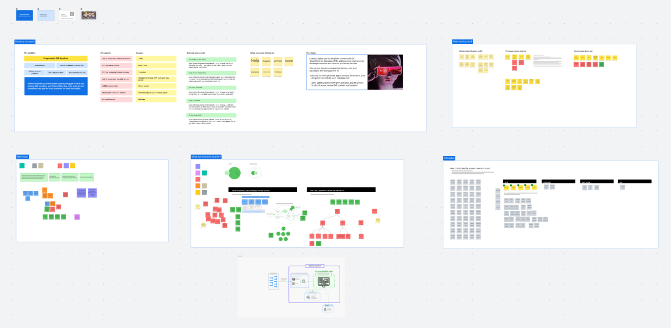
Professionals working in schools often faced a confusing patchwork of digital services. There was no consistent way to sign in, browse available support, or complete key tasks. Some services were hidden behind internal jargon or based on knowledge of programme names, while others were task-based but difficult to find. For internal teams, this fragmentation created ongoing challenges around service ownership, duplication, and visibility.
What I did
I worked from early alpha through to private beta, leading on interaction design and collaborating closely with content designers, developers, policy teams, and other stakeholders.
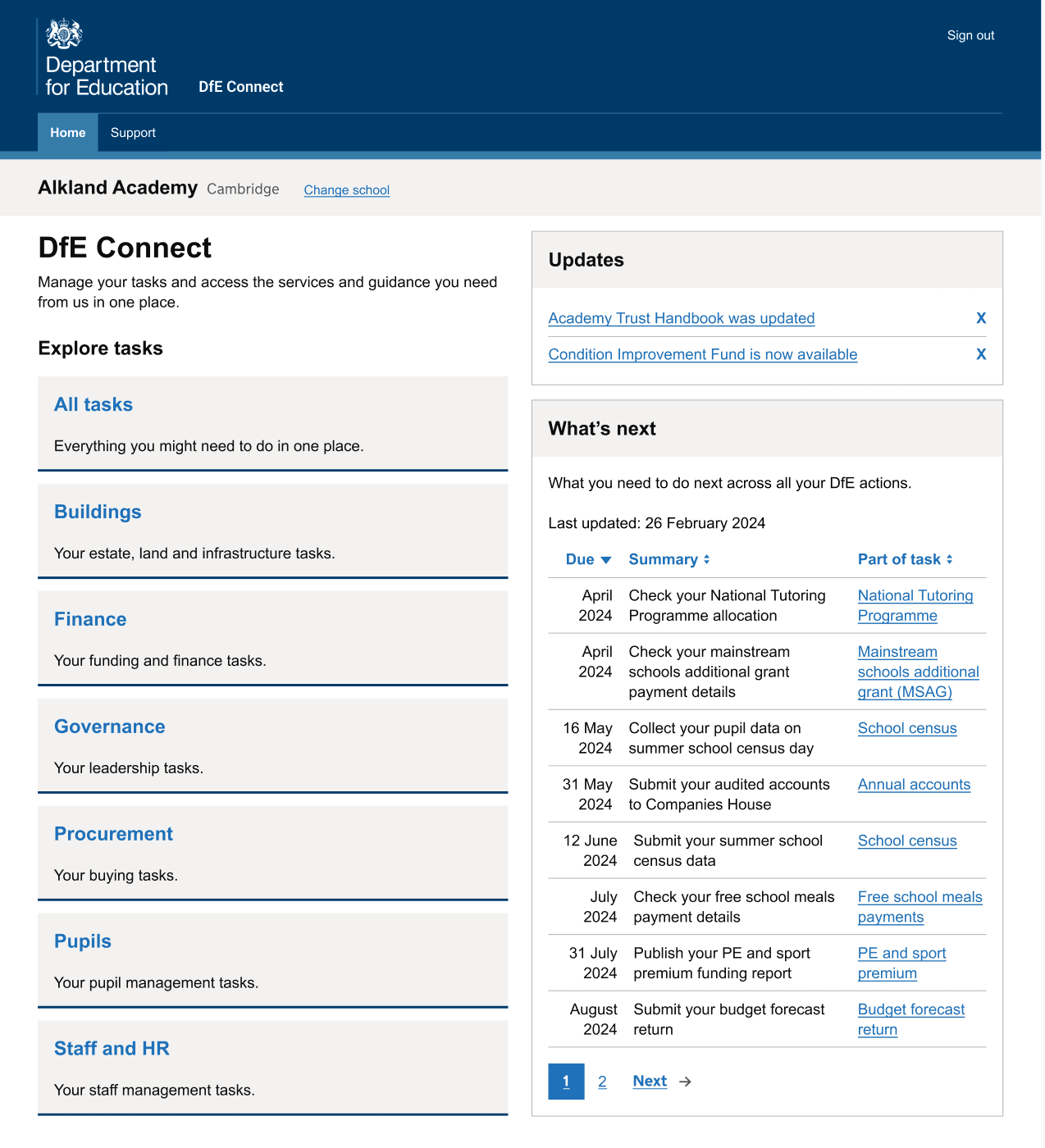
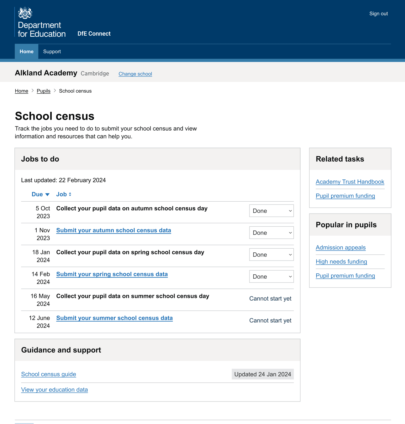
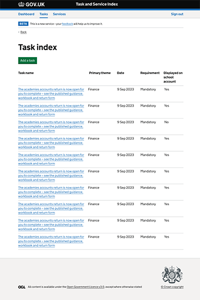
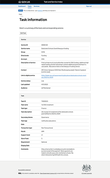
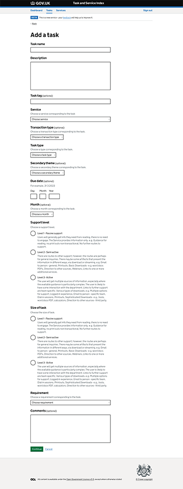
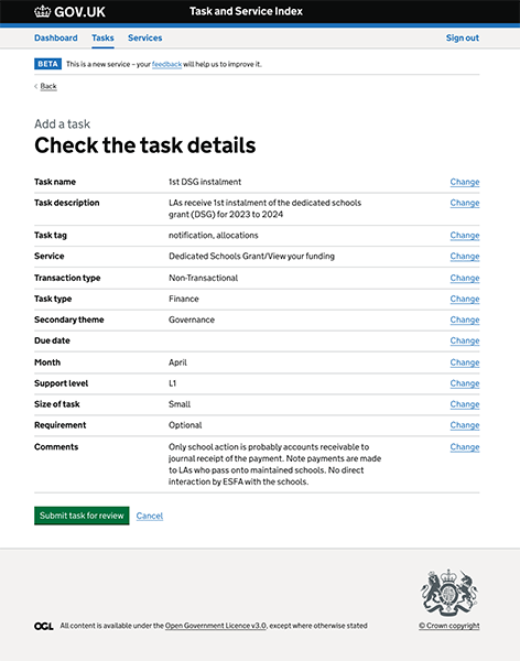
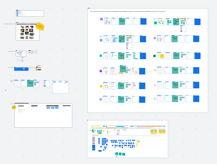
I helped shape and prototype a task-based index to make services easier to find and use. This involved exploring patterns for filtering by eligibility, improving onward journeys, and reducing confusion between similarly named services. I built prototypes in Figma rather than the GOV.UK Prototype Kit by request, we tested them with users internally and in schools and trusts, and refined the approach based on what we learned.
As the service evolved, I also facilitated naming workshops to explore how it should be positioned. The (link opens in new tab)standard GOV.UK naming model didn’t quite fit — this wasn’t a transactional service, but a gateway to many. I adapted naming activities to reflect that and ultimately proposed the name DfE Connect, which was adopted. The name stuck — and even led to the team mascot, Connie the Connect chipmunk, which became a surprisingly beloved part of team culture.
The platform was designed to work with existing DfE credentials, allowing users to sign in and access personalised content and links to relevant services. While full single sign-on wasn’t in scope at this stage, we laid the groundwork for future integration by structuring user journeys and UI patterns in a way that could support it over time.
Alongside delivery, I contributed to the wider design community — co-facilitating workshops, supporting design ops documentation, and sharing thinking across cross-gov Slack channels and community events. I regularly fed into show-and-tells, mentoring conversations, and design critique sessions — building a strong peer network and helping create space for open, low-ego collaboration.
The outcome
The public-facing platform launched in June 2024 and is now in active iteration. Early feedback from policy colleagues and school users has apparently been positive, with usage data showing improvements in task completion and service discoverability. Internally, the new service index has become a clearer foundation for service planning and ownership, and hopefully the work influences wider platform design decisions.
What I learned
Designing across multiple service areas required balancing clarity for users with internal constraints — including policy, ownership, and legacy systems. The rebrand mid-project was a good test of adaptability, and reinforced the need to keep users anchored in what feels familiar. Internal-facing services deserve the same level of care and accessibility as public services — they may not be visible (to the public), but they’re no less critical.
This was a great example of a collaborative, systems-aware project, and is something I’d love to build on in future platform work.
This project reinforced something I’ve always believed: that good design builds trust — not just with users, but with teammates and stakeholders. It also reminded me that considered design in complex systems isn’t always showy. Sometimes, it’s the quiet decisions — clearer links, better naming, smoother flows — that help people feel less overwhelmed and more in control.