From friction to flow — A practical redesign for Mind’s website
Project overview
Mind is a leading mental health charity in England and Wales. I led the interaction and UI design for a major redesign of their main website, starting in 2017 and continuing through to launch in mid-2020. The project aimed to move the site to a new platform and CMS, while improving the donation journey and making content more accessible and supportive. I worked as part of a multidisciplinary team alongside content designers, developers, product managers, the internal Mind digital team, and their wider teams on specific elements relevant to each.
The problem
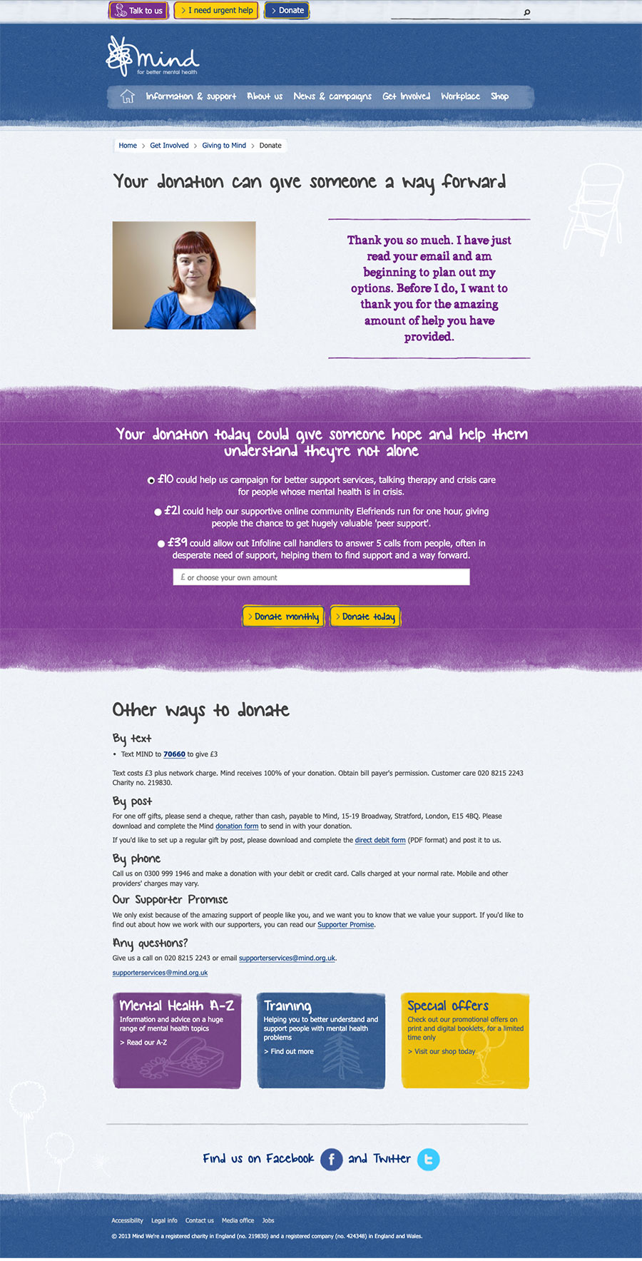
The existing Mind website had become difficult to maintain and inconsistent in how it presented information. Some user journeys were long or confusing, and the visual design didn’t fully support the needs of people navigating the site during times of distress. The donation journey, in particular, had grown cluttered and confusing over time and didn’t meet accessibility expectations — despite being a vital source of income.
What I did
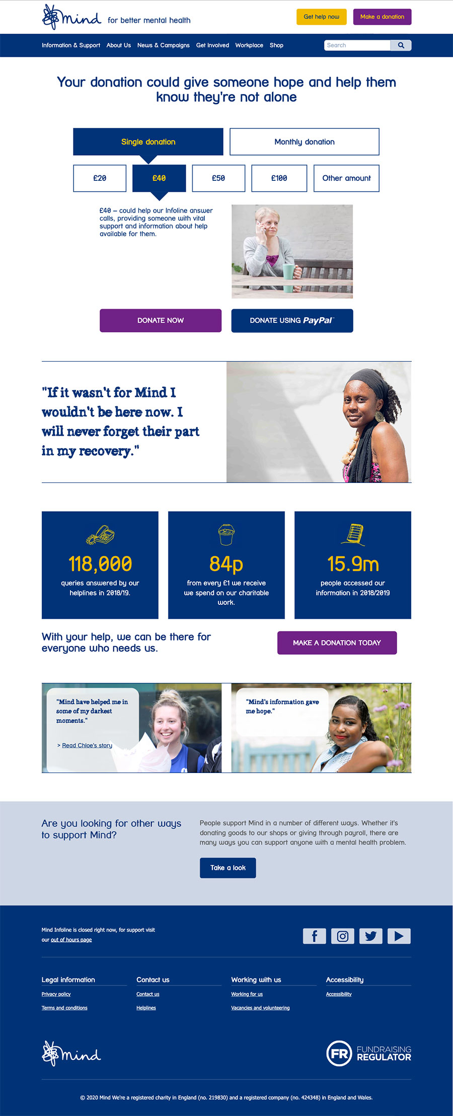
I led the design of the new donation journey and supported work on key content templates and page types across the site. This included mapping existing flows, designing low and high-fidelity prototypes, and working closely with developers to ensure the build matched the design intent. The donation process was restructured to reduce friction, introduce reassurance, and clarify calls to action.
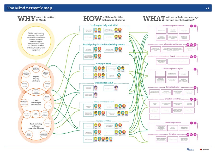
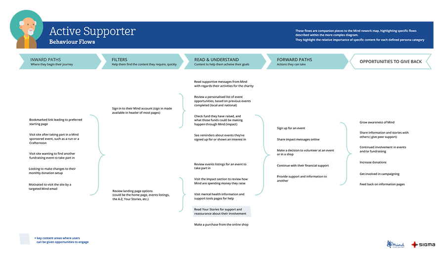
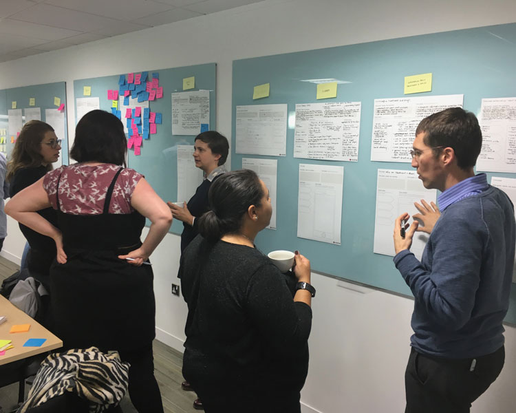
I co-designed the Mind Network Map and a series of persona-driven behaviour flows with a colleague, after challenging the output from a previous agency. Their research lacked the depth needed to support accurate user journeys, so we worked with the available evidence and collaborated closely with Mind’s digital team to rebuild a more realistic picture of how different people accessed support and navigated Mind services. The Network Map became a central internal artefact — helping teams refocus the site’s structure and content around the lived experiences of its users.
Throughout the project, I supported accessibility reviews, refined visual hierarchy and spacing, and ensured key components followed WCAG 2.2 guidance. I also contributed to internal documentation and post-launch handover materials to help the Mind team manage the site sustainably.
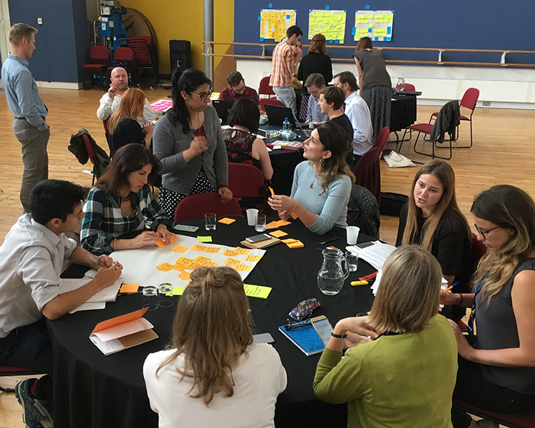
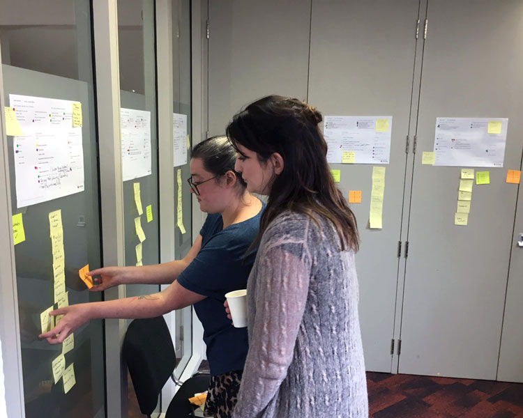
We used a series of collaborative workshops and behaviour modelling to validate our approach and identify gaps in earlier research.
The outcome
The new site launched in summer 2020. Within the first month, Mind saw a 70% increase in online donations, attributed to the new journey’s improved clarity, reduced steps, and greater trust signals. The new templates made it easier for content editors to maintain consistency, with call centre feedback and usage stats showing improved understanding and readability.
Feedback from both internal and external stakeholders was positive — particularly around the simplification of key journeys and the improved emotional tone of the site. One of the clearest examples was the redesigned donation flow — a focused change that made a measurable difference.
What I learned
Even the most content-rich websites benefit from structural simplification — especially when users are emotionally overloaded. This project reinforced how crucial accessible interaction design is in the mental health space. It also reminded me that performance improvements often come from small, considered changes rather than big dramatic ones. And that’s something I carry forward — a belief that considered design, grounded in accessibility and empathy, is often the most impactful. Especially when people are at their most vulnerable, clarity becomes a form of care.
Since the redesign Mind has gone through a brand redevelopment with branding agency DesignStudio. They kept the logo but changed fonts, and developed the colour palette and messaging. (opens in new tab) Take a look at the site now.