University of Liverpool — Building foundations for better design at scale
Project overview
- Client: University of Liverpool
- Timeframe: May – August 2023
- Role: Designer
The University of Liverpool wanted to improve the usability, accessibility and marketing impact of their website — while laying the foundations for a long-term design transformation. Working as part of a small team, I helped redesign key pages, refine the site’s information architecture, and support the initial development of a new design system.
The problem
The website had become inconsistent in both structure and visual design. Content was often led by internal structure rather than user needs, and page templates didn’t fully reflect the brand’s potential or marketing goals. Departments often worked in silos, which made the experience feel fragmented. There was also no central source of truth for design standards, components, or guidance.
The university's digital team were aware of these challenges and wanted to bring in outside help to reset the approach, build internal capability, and support long-term consistency.
What I did
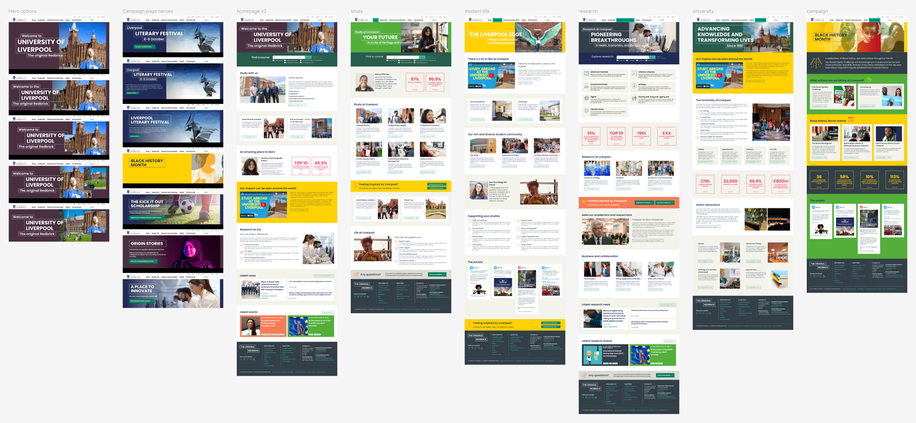
Led visual design for key pages and campaign templates
I redesigned the homepage, About, Study and Research pages using a mobile-first approach — applying brand elements more meaningfully, improving content hierarchy, and shaping visual patterns for wider reuse. These designs later formed the basis for campaign page variants.
- Introduced layout consistency using a modular grid
- Brought in visual motifs from the ‘red brick’ identity (e.g. monoline holding shapes)
- Supported the campaign team with CRO-focused design patterns
Facilitated content modelling and co-design workshops
I ran collaborative workshops with the university’s digital team, helping them reframe pages around user and business needs. We used content modelling to expose gaps, clarify purpose, and prioritise what really mattered. This process proved transformative for the team, helping them align across departments and rethink how content gets created.
“These sessions were a real turning point — we didn’t appreciate just how much work was needed - more people need to be involved!”
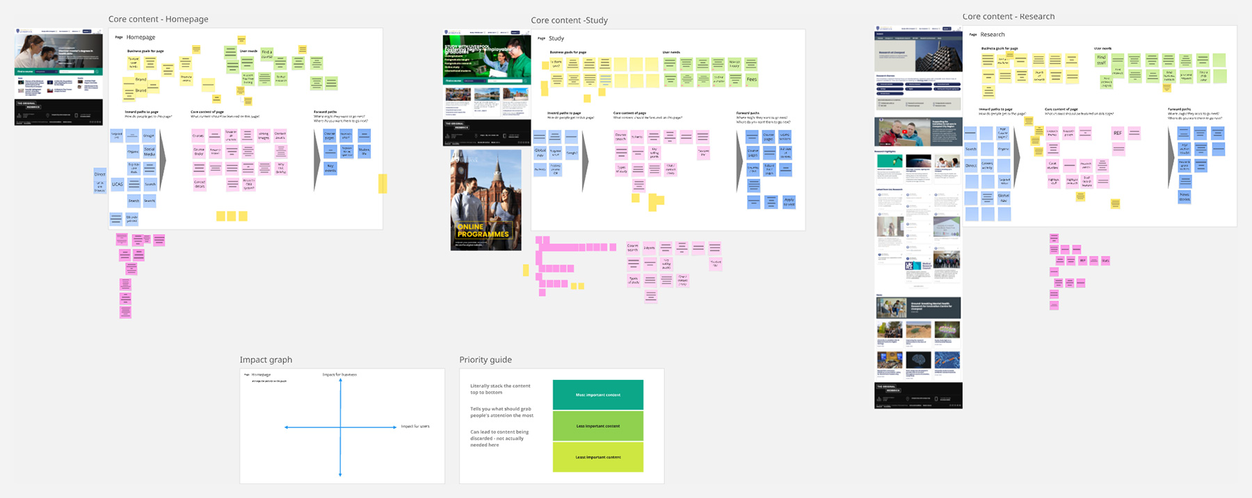
Supported IA review and simplification
While I wasn’t the IA lead, I supported the review and testing of the existing structure — including top-task analysis and page-level audits. We prioritised clarity over internal jargon, and used impact mapping to decide what stayed, changed, or was removed.
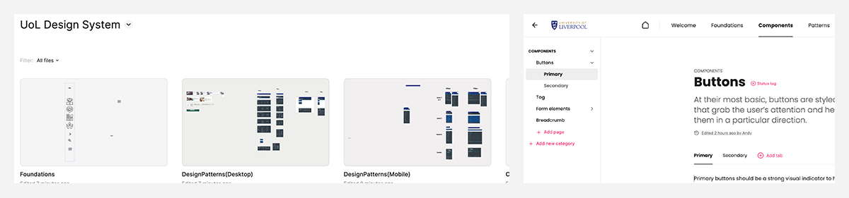
Helped set up the design system foundations
Alongside my colleague leading on design ops, I helped migrate new designs into a scalable Figma library and set up the initial ZeroHeight structure. We ran workshops to map out:
- Who the design system needed to serve
- What assets already existed
- How governance and updates could be handled sustainably
The work gave the team a shared starting point and the confidence to grow it further.
The outcome
The visual designs were well received — especially the way brand elements were embedded more meaningfully. Content modelling sparked major shifts in how teams approached web content, and early design system foundations gave the digital team a solid springboard.
While implementation was phased and ongoing, we later heard from the Head of UX that the project had helped reinvigorate the internal team and gave them a clearer path forward.
What I learned
- Brand elements carry more meaning when they’re embedded in structure, not just style
- Showing the why behind content decisions can create lasting change, even after the project ends
- A light but purposeful design system foundation can unlock a lot — without needing to solve everything at once.
- Even in short engagements, investing in collaborative design thinking can leave a legacy. The most valuable thing we built wasn’t just the UI — it was momentum.