Config 2025: Drawing tools, dodgy code, and a touch of déjà vu
I have a confession to make. I reacted to the Figma Config news before I’d actually watched the keynote.
“These updates feel showy, not useful. Something that might appeal to certain designers, but not good UI and UX designers.”
Yes, I know. I should know better.
As someone who champions Figma at work, I’d planned to watch it anyway — but like many, I saw the headlines on social, caught a few hot takes (and shared one of my own), and started forming an opinion before doing the proper legwork. So I sat down, watched the whole keynote, made notes, and here we are: a slightly more measured take, but with the same core concern lingering underneath.
There’s a lot to like
First, let’s give credit where it’s due.
The new Grid updates are excellent — the ability to span cells and use grid within auto layout is exactly the kind of quality-of-life improvement that makes interface design faster, more consistent, and frankly less annoying. Giorgio’s description of layout as “a gravitational force... that is always there to make sure things stay in place” stuck with me. That’s what good layout tools should feel like: invisible until you need them, then quietly supportive.
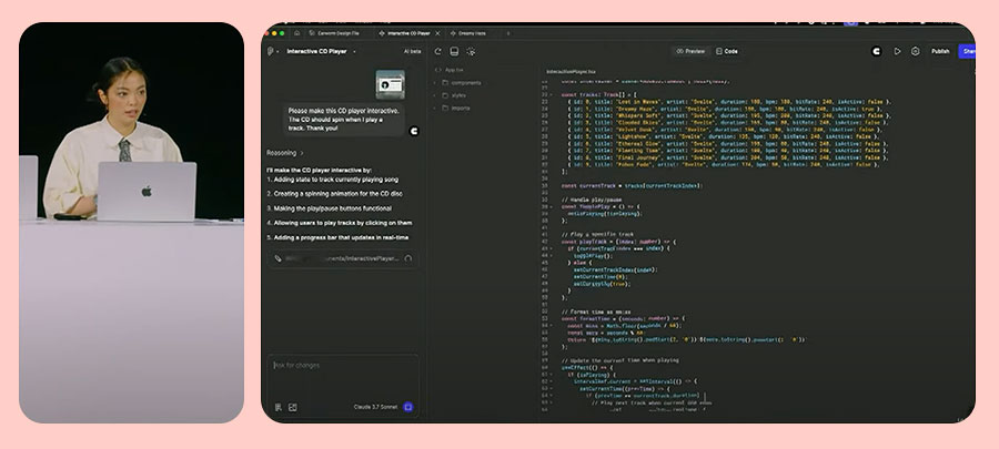
Figma Make — yes, it’s an LLM feature, and yes, that’s a loaded space — but it looks useful. I’m genuinely curious to explore what it can do, and how much of the “clever faff” it can absorb without getting in the way of actual thinking. (Also, minor note: I really liked Holly Li’s shirt.)
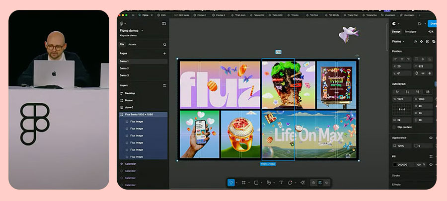
Figma Buzz is Canva-ish, but in a way that makes sense. It lets visual designers create controlled templates with data injection (the CSV link is a really useful addition), and I can already imagine the time saved for social teams.
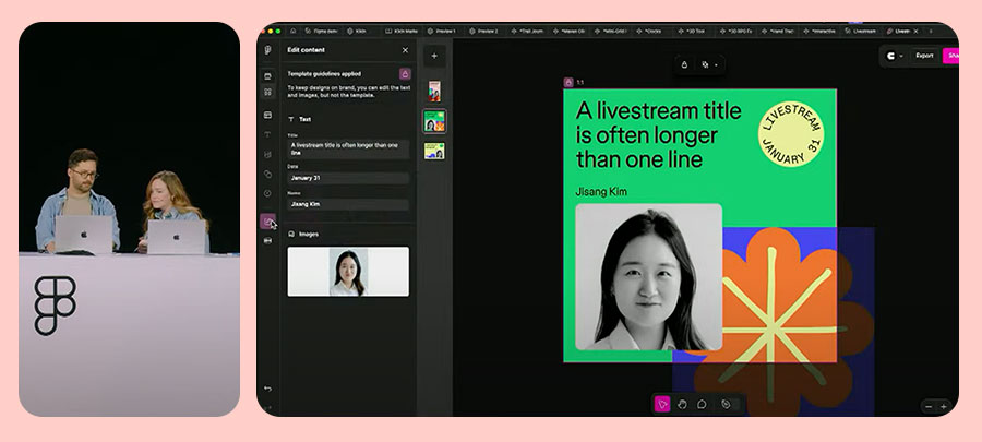
And the Content Seat? Love it. My content design colleagues often apologise for breaking layouts when they make edits in Figma. Now they don’t have to. It’s a small gesture, but one that signals a growing respect for content roles in design tooling — and that matters.
But then… Figma Sites
This is where the unease sets in.
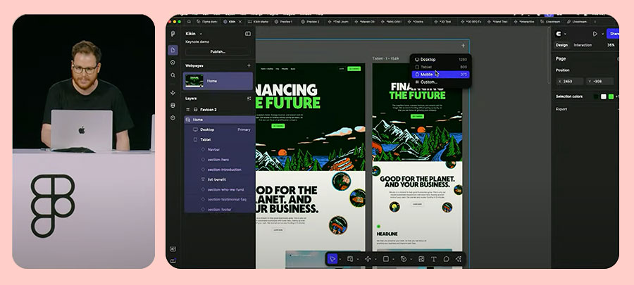
Good to see Tom Giannattasio on stage again — I’m old enough to remember Macaw (and even Dylan Field’s tweet when Figma was first announced). The breakpoint management and animation triggers look really well thought through, and honestly, launching live sites straight from Figma does sound amazing.
Until you look at the code.
Accessibility advocate Schalk Neethling did just that in (link opens in new tab) a quietly devastating review, and… it’s not great. The HTML lacks semantic structure, has no headings, relies heavily on JavaScript, and is unusable with a keyboard or screen reader.
“It’s 2025, and we’re still seeing tools outputting code that doesn’t meet basic accessibility standards. That’s not progress.”
I took a look at one of the sites demoed during the keynote myself ((link opens in new tab)practice-type.com) and found similar issues: no meaningful landmarks, poor focus management, and inaccessible interactions. This isn’t just suboptimal — it’s harmful. These are live URLs that will soon be indexed, linked, and referenced. They’ll be seen by non-technical users and assumed to be modern, best-practice outputs.
They are not.
Now, to Figma’s credit: it’s still in beta. And perhaps we’re not meant to take this as “production ready”. But if that’s the case, it needs clearer boundaries. A walled garden. A big “not suitable for launch” banner. Otherwise, we’re polluting the web with auto-generated inaccessibility — and that’s not a good look.
The Draw dilemma
Initially, I rolled my eyes at Figma Draw. Do we really need sketching tools in a UI design platform? But watching the demo, I’ll admit — it’s well implemented. The smoothing, the shape recognition, the blending into existing tools — it’s all very slick.
Still, I’m not convinced it was the best focus. I’d rather see prototyping get a proper upgrade — one that lets me carry form data between screens, toggle state, or simulate more realistic interactions. Axure did this over a decade ago. Proto.io does it now. Figma… still makes you fake it.
That said, viewed as part of a broader move — with Buzz, Make, and Sites — it’s clear that Figma is becoming a platform with multiple entry points: a bigger toolkit with different views for different kinds of creators. The Content Seat supports that idea. Maybe we’ll see more specialised “seats” emerge over time.
So what now?
Config 2025 was a huge update. And to be honest, I’m still digesting it. There’s plenty to like. Plenty to explore. And also — plenty to worry about.
I enjoy working in Figma. I want it to keep improving. But I also want it to stay focused on what made it great in the first place: helping teams design digital products well, accessibly, and collaboratively.
If we can keep hold of that centre — and not get too distracted by the shiny stuff — then maybe we’re still on the right path.
Watch the Product launch keynote and see what you think: